Pregnancy in Green
Green and orange make quite a pair.
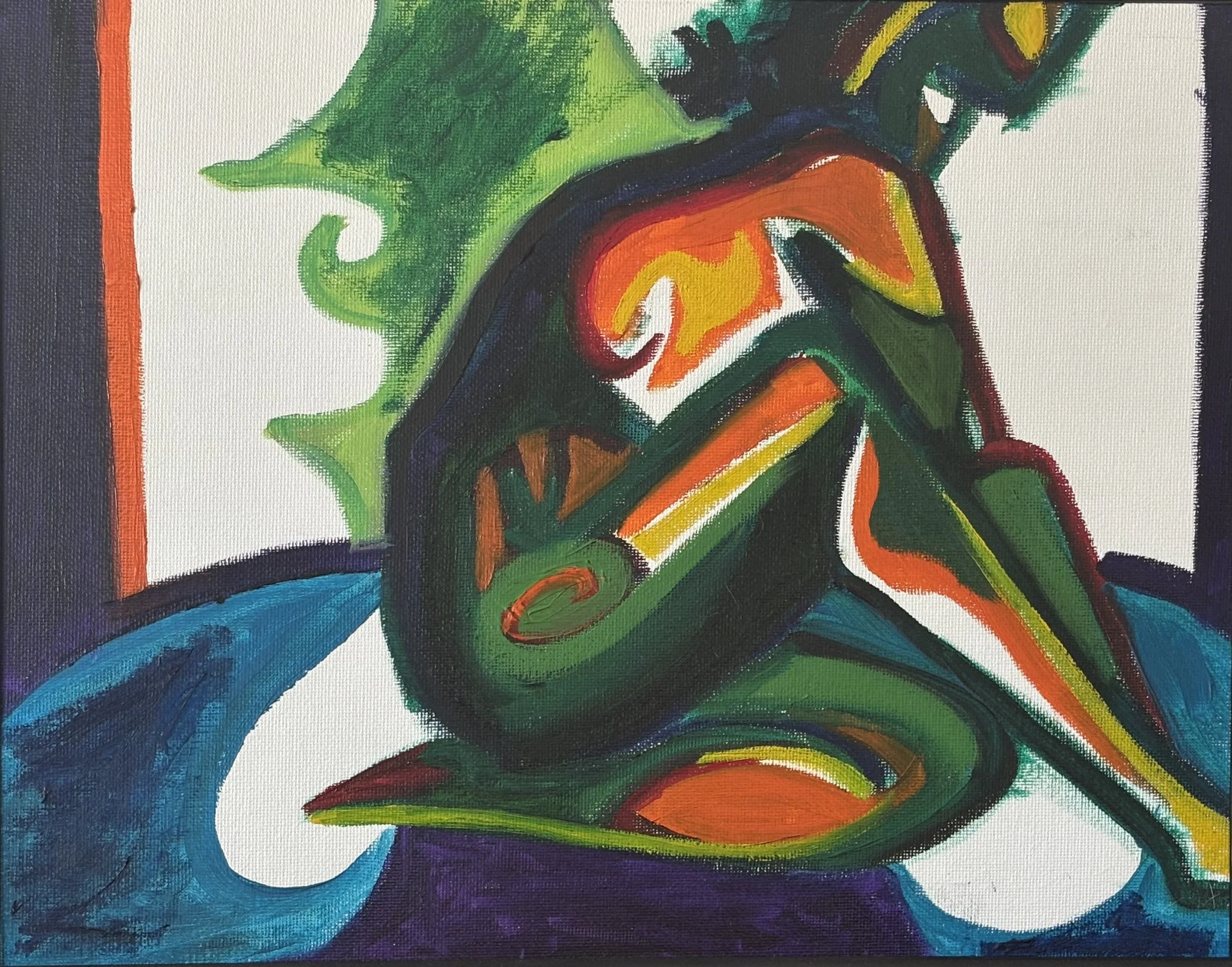
In this painting, I use the two complementary colors to create an abstracted portrait of a pregnant woman. The green gives the figure a sense of growth and movement, while the orange pushes back against it with warmth and energy. Together, they create a little visual tug-of-war that keeps the painting lively.
Pregnancy seemed like a natural subject for this kind of exploration. The body is changing constantly, and there is something fascinating about trying to capture that transformation without getting too literal.
I wasn't interested in making a perfectly realistic depiction of a pregnant woman. Instead, I wanted to exaggerate the shapes, simplify the figure, and let color do some of the storytelling. The result is a figure that feels recognizable but also slightly removed from reality as if pregnancy has turned the body into its own strange and beautiful landscape.
The green and orange aren't just decorative choices. They give the painting its personality. One is cool and expansive; the other is warm and insistent. They shouldn't necessarily work together quite as well as they do.
But somehow, they do.
A little green. A little orange. A pregnant figure and a lot going on beneath the surface.